On Saturday I visited the UX Conference in Lugano, that was centred around the theme of healthcare. Many of the speakers spoke on what the future of healthcare and UX might look like, and while the speakers came from diverse backgrounds several themes continually came up.One of interest to me both as participant and as a service designer revolves around the concepts of accessibility. Particularly how can we create a more inclusive world for people that may have certain disabilities.
Two speakers in particular spoke directly on the subject; Andrew Zusman, a US/Israeli UX designer and Mark McWilliams a software engineer from the US working for for Orthocare.
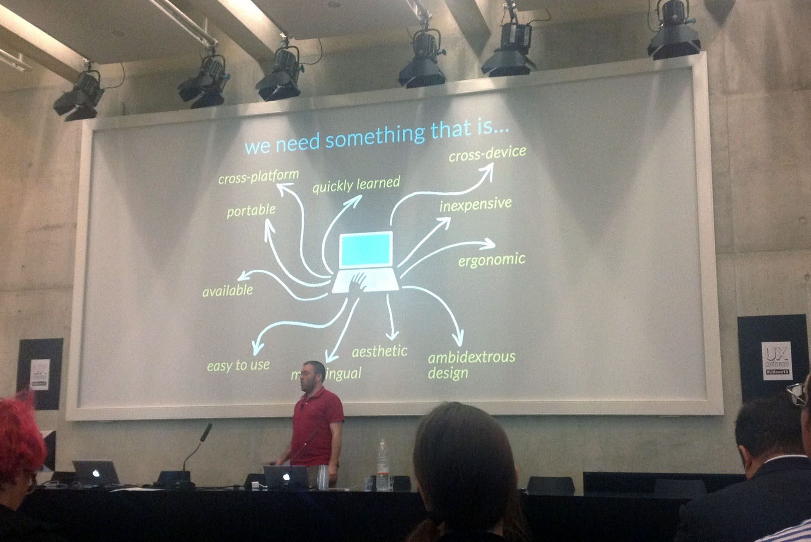
Andrew’s talk was very much a focused a call to action for designers + developers to work on new ideas to improve the typing experience for people with hand disabilities. He spoke about his experience working with people with only one hand, and how broken the typing experience is for these users. His solution, rather than creating specific applications for these users, was to focus on the principles of universal design, which advocates for design solutions that take into consideration everyone. Andrew gave an example of the ramps found on many street corners. While their original intention was to aid people in wheelchairs, the ramps quickly became liked by people without disabilities as well such as mothers with baby carriages. Proper inclusive design, quite often has the effect of creating a better solution for everyone even if the original focus was on people with diminished abilities.
Mark McWilliams on the other hand, had a rather futuristic look at accessibility, or rather something that was futuristic. He gave the story on how in 2010 he had to have his leg amputated from the tibia down. The experience rather than demotivating him, made him determined to find the best technology currently available to people in his situation. He found a prosthesis that in addition to physiotherapy, allowed him to live a relatively normal life. But there were always the limitations that came with it. If he wanted to adjust the angle of the foot to feel more comfortable walking, he would need to book an appointment with an orthopedist, who would manually adjust the angle. As well as the prosthetic foot couldn’t bend, he would often find himself in situations, such as on the bus, where he would accidentally trip people. Eventually Mark was informed about a study by Orthocare who was working on a digitally connected prostheses, and he became a test subject. What made this prosthesis special is that it was embedded with sensors that could, in real time, analyze the force and pressure he was exerting onto his foot, allowing the prosthesis to adjust angle automatically.
During the talk he showed us a rather amazing demo, where we could literally see behind him a graph that would change depending on whether he was standing or walking, tracking his movements and adjusting accordingly. Coming back to Mark’s story, testing this product amazed by him, and inevitably as a software engineer he asked the question, is there an app for this? Wanting to get more involved in the project and looking for a career change, Mark began working for Orthocare developing a mobile application name Gailleo, that through bluetooth could connect to his prosthesis and allow him to make a number of adjusts on the fly, from sensitivity to being able to track his walking patterns. It was quite amazing to see him literally connect to his leg and make changes to the foot.
Mark’s also spoke about the reasons behind many of the design decisions for Gailleo. There was a conscious choice to make the application as simple and clean as possible to make it clear for the widest range of users. To create interactions that made the user feel that the application was working faster than it really was. A strong focus on feedback, and most importantly a strong emphasis on making a digital product people could trust. “Fitbit is great but it isn’t a life or death product”. Building a working application in this case became very important because he did not want to leave users in a vulnerable position, or one where they could be a danger.
Even though the subjects of the presentations revolved around products, looking back, you can see how the principles mentioned in both talks could be applied to service design. Service design has an enormous potential to help people in these situations, and discover better solutions to common frustrations. From designing a way to better the grocery shopping experience for people with visual impairments, or creating a social inclusion program for people with cerebral palsy that have a harder time meeting people, there is a myriad of issues that quite often can be traced back to a badly designed service experience.
Firstly, the question of universal design is pertinent when you consider that fact that even if a person has a disability they don’t want to feel disabled using a product. It’s why Andrew found that while there are keyboards made for people with one hand, they still choose to use a regular keyboard, because it made them stand out less. So whatever solutions are created even on a service level, need to create a sense of social inclusion and ultimately be something that can benefit everyone not only the person with disabilities.
Secondly, you need to make sure you take care of your users. While many projects start with idealized dreams, they need to be rooted in the understanding that these are people that will place a great deal of trust in your service. Mark came from a position where he could himself become the prototype to try out many of things he wanted to test, but in a more realistic situation you may not work with people that can give you that level of effort. So prototypes and tests, need to be carried out with a greater care and understanding to ensure that the final outcome is something people can place their faith in.


