…said John Plunkett, the first creative director of Wired USA, to explain the editorial line of his magazine.
This quotation is how David Moretti, the Wired Italia art director, decided to start his speech at the Milan Social Media Week 2014. The lecture’s title was “How the information design is changing”.
Let’s try to summarize the key points of this interesting talk.
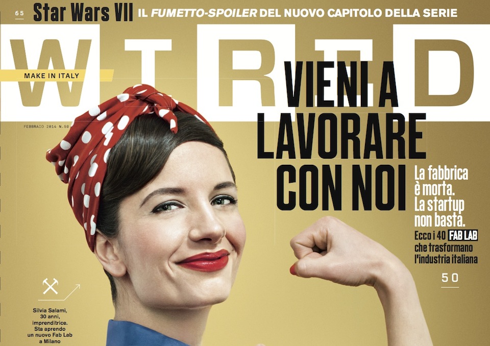
Wired Italy was born in 2007, 15 years after the first release of Wired USA.
At that time there was the certainty of being a disruptive shift in the field of Italian information, and that was really what they meant to create.
Indeed, Wired works on a basic concept: differentiate what is information from what is communication. They don’t want to just make news available or provide a serie of data; communication is something different: they utilize graphics and all the visual communication tools to help the reader understand, and then to provoke him in order to make a dialog start.
So Wired uses provocation as its main vehicle for letting the conversation with the reader begin. They want him to create his own opinion through an emotional instrument.
“We are looking for troubles”, that’s the Wired pay off and it’s clearly a declaration of intent.
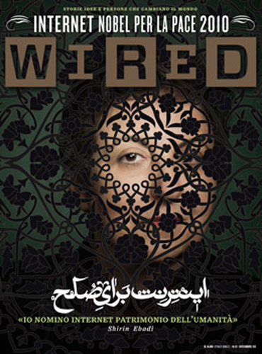
To make an example David chose the Wired issue they did in collaboration with Shirin Ebadi, the Iranian Nobel Peace Prize. At that time in 2009 there was a big debate in Italy about the risks of the internet as an insecurity and terror place. Wired came up with this to show the other face of the web and how it was useful for the students in Teheran living in a tragic situation.
The emotional journey of the reader starts from the very beginning of the magazine: Wired introduces the main themes even before the first page, through the use of special colors and papers, sophistication like paper punches or embossing, all unexpected elements. This play around with papers is very important, especially with the monthly magazine experience. David compares this experience with a dance choreography, full of interruption moments, pauses and retakes.
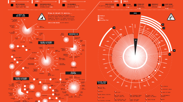
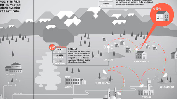
He then start talking about info-graphics and he begins saying that “info-graphics is not a style, it is a language“. The important thing is that it’s packed with meaning.Wired has every month a dedicated space for info-graphics, called Infoporn.
Within the Infoporn we can find atlas or illustrations that show a process and there is always a legend that helps the reader with the comprehension.
I really suggest you to watch the conference and I invite you to go see the outdoors exhibition that Wired has prepared in Via Dante to celebrate its 5th birthday, from the 6th to the 30th of March.
There will also be the second edition of the Wired Next Fest on the 16th, 17th, 18th of May at the Giardini di Porta Venezia, with lectures, exhibition and workshops on information design.
Find out more:
http://timofficial.it/2014/02/come-sta-cambiando-l-information-design-social-media-week-milan-2014.html
http://nextfest.wired.it/#main
