“The MIT Media Lab move fast”
The MIT Media Lab is an interdisciplinary research laboratory at the Massachusetts Institute of Technology devoted to projects and researches about technology, multimedia, sciences, art and design.
Founded by MIT Professor Nicholas Negroponte and former MIT President Jerome Wiesner in 1985, the Media Lab is actively promoting a unique and antidisciplinary culture, encouraging the most unconventional mixing and matching of disparate research areas. It creates disruptive technologies that happen at the edges, pioneering such areas as wearable computing, tangible interfaces, and affective computing.
The Media Lab isn’t really a single entity. It’s an umbrella. It spreads itself over 23 very different departments, from Macro Connections to the Tangible Media Group, each trying to forge the future in its own different way
“Inventing a better future” is the theme of the Media Lab.
Now the Media Lab is reinventing its visual identity with the help of Pentagram partner Micheal Bierut, that talks about the new design in an article for Fast Co.Design.
The first logo of the Media Lab was revealed three years ago for the celebration of the 25th birthday.
It was design by Brooklyn-based designers E. Roon Kang and Richard The, based on an algorithm that coughed out over 40,000 permutations of the logo. It was a colorful and dynamic logo that well represents the spirit of innovation of the Media Lab, but it turns to be even too much dynamic and random. There wasn’t a clear identity of the Lab.
Bierut was asked by Negroponte to create a more static identity that could still reflect every groups in the lab.
“Even though we were asked to come up something more fixed, the theme of variability still seemed meaningful to me,” Bierut tells to Fast Co.Design. “It’s an acknowledgement that the Media Lab is not fixed in time or purpose, but can accommodate so many different ideas and directions in terms of what passes through it.”
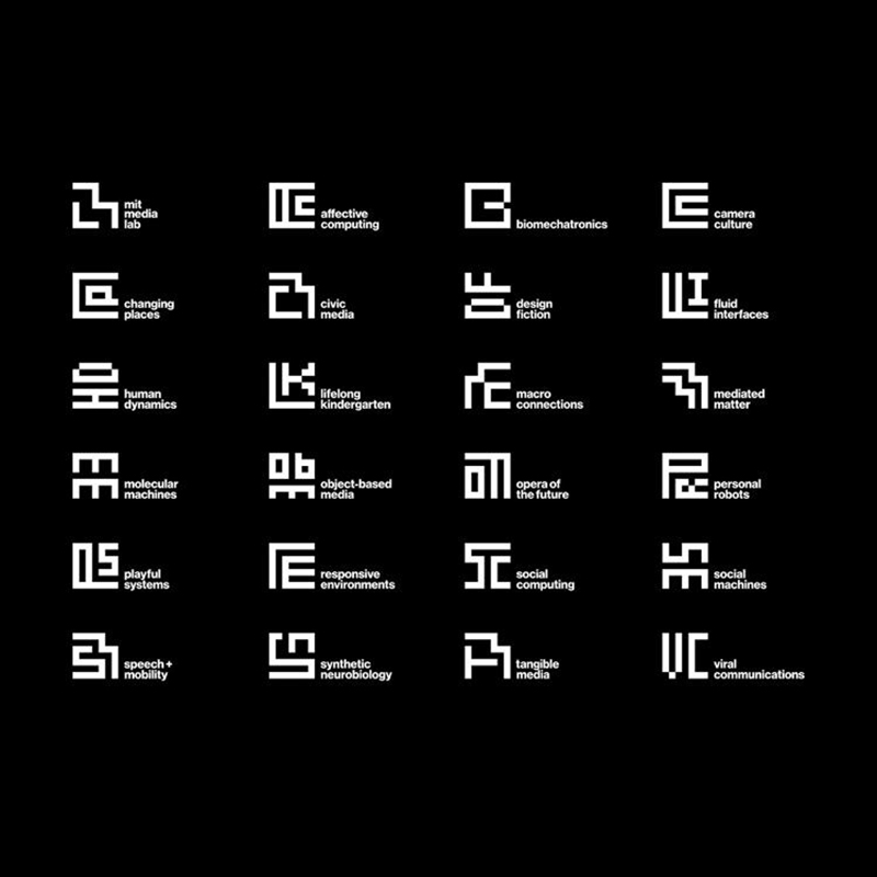
The new logo is an abstract set of pixel-art hieroglyphics; it’s essentially a typeface, masquerading as a logo.
Using the same 7×7 unit grid that figured in the 25th-anniversary logo, Bierut calculated all the possible ways a maximum of three different letters could fit into 49 pixels, yet still be readable.
The Media Lab itself has its own logo, denoted by a low-res “ML,” where as Media Lab departments each have their own sibling identities, represented by their initials.
Is outstanding as the logo is innovative but at the same time seems, in my opinion, to refer to a view almost primitive. It’s so simple and clear that it looks like it was always there.
To read the whole article:
http://www.fastcodesign.com/3037339/pentagrams-michael-bierut-rebrands-the-mit-media-lab#4

