3 years ago, while I was working as an Interaction Designer for a software house which developed an ERP for Retail I was given the opportunity or better yet the challenge to sell the concept behind UX – User Experience and how we could design business thinking in UX.
I remember it like it was yesterday, I started writing down all the ideas ideas that I had in my head on a piece of paper. In about 3 hours I had a lot of information for my plan and what I wanted to sell.
I didn’t review it, but I went to show it show it to my director anyways. Later another manager saw my sketches and asked me, “please, improve it before showing it to him” – it was too late! The director had seen the quick draft but was quite excited about it. At the end he approved it and asked me to continue working on it. He also awarded me with a trip to the NRF Retail – Big Show in New York. I thought I was in a dream at that moment, but it was real happening.
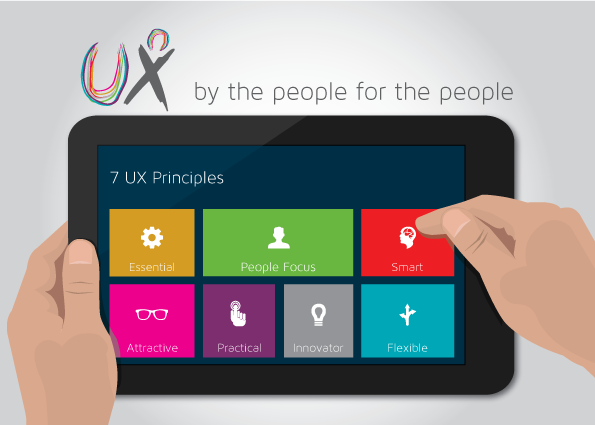
So I started to hear & listen to what customers, developers, testers, managers, others understood about good experiences. In the first version I came up with 34 principles – which was way too much! People can’t grasp 34 principles. After some more sessions with different people I managed to narrow it down to 15 principles. Finally I cut it down to 10. Well 10 was good, but I knew I could combine some and redefine others. So I thought, How about 5 principles? In the end I closed with 7 UX principles that define and helped to better sell our strategy to think about user experience:
1. Essential: Great experiences are simple. Provide clear and objective solutions. Think about what is the essential thing to be done in a specific task and provide only the information necessary at that moment.
2. People Focus: Speak the user’s language, they are the ones that spend the day with the system. They both need to like each other and get along like good friends. Use strategies to understand your customers better, talk with them, they have a lot of things to tell you.
3. Smart: The user doesn’t need to think. The system should think for him and propose solutions. Have a lot of data that could be transformed in smart solutions, provide good answers for the people that use your system.
4. Attractive: Engage people with a light and visual interface, turning it into a more enjoyable experience. I heard a lot of people that said it doesn’t have to be beautiful, it has to be functional. Are they serious? Please, think about the colors that you will use, provide a nice harmony between the colors. It should to be functional and beautiful.
5. Practical: Have you ever been so far with few steps? Turn complex tasks into simple and agile tasks. Time is money! People don’t have a lot of time to spend with small things.Think about the tasks that people often do and how you can reduce time and effort to compelte a task. Think out of the box, I’m sure you will find a different way to do things.
6. Innovator: Be ready to change and don’t restrict yourself to your current model. Bring innovation to your customers, innovate with technology that you are developing, innovate the interface. Ask yourself whether the patterns that you are using make sense at this moment. Be innovative in everything!
7. Flexible: Give Options! Make the system adapt to the user needs and don’t force the user to adapt to the system. Provide a solution that could be used in a different way for different culture, talk with people to better understand who your are designing or creating for.
So far, these principals have helped me to better sell the idea and meaning of UX. I hope this brief presentation will help you to start implementing them in your own work.
I’ve also prepared a slide-show presentation that you can find here:

