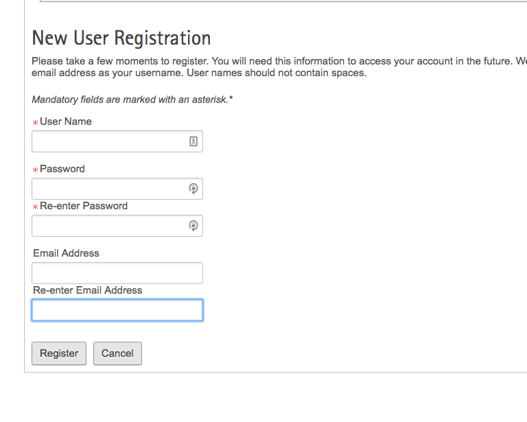
Far be it from me to tell you your job. That would be rude. And you’re right, would I like someone else telling MOI how to do my job? Of course not. So how I can put this? This is just me ‘curiously asking’ not telling and this is me ‘providing user-centred insights’. And you can’t take it personally because we’ve never met. And if we did, we’d probably get along famously and then I’d never want to broach this subject because you’d listen and then not say anything but fume silently and when I’d ask you if I shouldn’t have said anything you’d say ‘No it’s fine. It’s great to get feedback from….. people outside of the industry’. And then you’d not say anything for the rest of the day and basically we’d grow apart and that would be that. So without that future getting in the way, I’m rolling up my sleeves, I’m stubbing out my cigars, putting in my false teeth so I can think better and here I go.
Overarching assumptions you can nearly always make:
- Users want to do SOMETHING ELSE on the site. They want information. They want to submit a CV, or they want to buy something. They want to do that stuff, not fill out the registration form. So make it snappy, easy, elegant.
- Make it fit for purpose. I’ve been a freelancer for 12 years now and over the years, I’ve probably had to sign up to over 200 ‘XYZ HR DatabasePlatform’ just to apply for a single job. I don’t want a profile on EmployerXYZ.com. I won’t apply EVER again. Just this once. So is it really truly necessary I need a password that is longer than the Euphrates and more complex than Donald Trump’s weave? Exactly what risk are you trying to mitigate here? That someone could apply for a fabulous job on my behalf and I’d get it? I wish they could.
- OK, so you’ve decided that because I’m applying to HRH Queen Elizabeth’s household to be a corgi counsellor, secure and encrytped is necesasry. OK, but look — tell me IN ADVANCE what your complicated rules are. Don’t let me go through this (seeming simple and short):

…entering the pet name for my favourite toe only to find that I’ve failed before I’ve even begun. No-one wants to be a loser. You’re telling me I don’t have any imagination and frankly, it hurts:

It feels like the problem is not with the password, it’s with me.
YOU ARE NOT VALID, YOU ARE AN IDIOT, YOU SHOULD KNOW WHAT A SAFE PASSWORD LOOKS LIKE BY NOW. IF YOU DON’T THEN YOU SHOULD NOT HAVE INTERNET ACCESS. YOU A FOOL.
That’s what we, the time impoverished-rushing-rushing-to-complete-the-task users feel.
Just one last thing about addresses.
4. So you want to know where I live. That’s cool. A bit weird as I’ve told the aforementioned 200 companies my exact location and not once has anyone sent me pet rabbits, gift cigars rolled on the thigh of an organic camel or even a nice hand written note. So again, I’d love to know if this whole thing is really necessary. But let’s say it is. Then:
5. Let me choose my address, town, city, country. It’s amazing how many of you try to make me select which United States state, Auckland or Wellington is. I HAVE to select something and you don’t recognise any other country in the world. This example is an Australian one from an Australian job site. On the one hand I think some of the job site web/interface/UX/coders/designers DO know that the world wide web can be accessed by people OUTSIDE of their home town, but I don’t know, maybe these ones forgot. I’m living in Munich, applying to Australia. I know completely baffling.


Yes, I could only choose Australian states. Those famous Australian States, dotted throughout Germany…. I always forget about them!
So in closing, when you’re coding a registration form, spare a thought for users. Yes we’re idiots, but you can help us.
- Make it simple
- Make it short
- Make it accurate (e.g addresses)
- Make the form appropriate to the task (should it really truly honestly take 6 minutes to register at your local cinema website just to buy a ticket online? Do you really need to ask me a reminder question?)
- Make it painless
Here’s my MGBS (mathematical global benefit system):
- If on average 1 out of every 3 people experiences a frustrating registration form moment
- If those people (like me) experience this teeth-jarring frustration on average say once every 3–4 weeks that delays their ultimate task by say 2 minutes, that’s:
- {cue sound: machinery clanking, generators roaring into life and finally R2D2 ‘answer’ sounds}
- That’s 6.8 million hours SAVED each year!
Just think of the productive, peace-generating things humans could do with THAT LOST TIME! They could cure cancer, they could finish their knitting project, they could practice spinning plates or phone that long lost friend who was some kind of coder person they fell out with over ‘user-insights’ they once tried to share…

